6 Poppy Outdoor Furniture Colors and Paint Palettes to Up Your Home’s Curb Appeal
And meet our new collaboration with Industry West!

Meet your newest way to get creative with Clare colors: a limited-edition collection of outdoor furniture created in collaboration with the experts at Industry West. We selected six of our punchiest, most versatile paint colors to bring to their outdoor chairs. Each piece has a clean, modern design and is crafted from durable iron that’s treated to maintain vibrant color against the elements. They’re a simple, instant way to spruce up your space with our most beloved hues.
To help you get started, our team of color-loving experts has pulled together six inspirational, fool-proof palettes to use on siding, trim and a bonus area (like the mailbox or as outdoor furniture colors) for a fun pop. They span the spectrum from sophisticated neutrals to bold and daring—so you can get a fresh look, no matter what your home’s vibe is.
Keep scrolling for all your outdoor color palette inspiration!
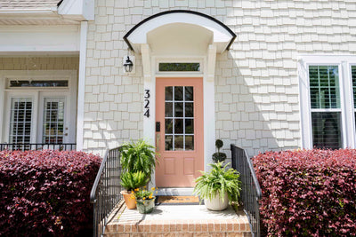
Beauty in Blue

With its nature-inspired beauty, blue is a natural choice for your home’s exterior. And this color palette plays that up, tapping into not one, but two blues to create a look that’s equal parts classic and crisp.
Start off by giving your siding or any other large surface a refresh with Timeless, our creamy, dreamy off-white that looks good in any light. Then come in with our deep navy Goodnight Moon on trim, the front door or shutters to make a statement without adding a ton of bright color. Top it all off with Blue Ivy as your bold pop with a piece from our Industry West collab, by painting smaller accents (like your mailbox or house numbers), or going for both!
Sleek and Sunny

If your decorating aesthetic skews more modern, you’ll love this streamlined combination that features a bright pop courtesy of Lemonade. This trio feels contemporary yet warm and is the perfect complement to midcentury builds or if you want to bring a modern vibe to your traditional exterior.
Our deep greige Shade will feel ultra unique on siding and will appear darker and more dramatic when under shaded trees or waning sunlight. Our best-selling white, Whipped, is the perfect choice for trim, balancing out the boldness while still providing plenty of warmth that’ll look great with an unexpected pop of color in the form of Lemonade. We love the idea of Lemonade on the front door to create a warm welcome for guests, but it also makes a great pick for outdoor furniture colors with our Industry West collab.
Garden Fresh

When it comes to exterior palettes and outdoor furniture colors, this is not your garden variety combo! Use this trio to play up the natural beauty of your exterior and make plants and flowers pop, or to imitate the appearance of greenery and create a lush look any time of year.
Light greige Penthouse is a refined but classic pick for your siding, a neutral that’ll feel timeless but also stand out next to other homes on the block. We also love the idea of painting it on your garage door or fencing. Punch it up with best-selling moody green Current Mood on shutters, flower boxes or partial areas of siding, then add patio furniture in Pop as the unexpected cherry on top.
Sweet Sophistication

Pink and green always look good together, and this combination of outdoor furniture colors is no exception! When paired with greige Flatiron, Meet Cute and Avocado Toast feel decidedly grown up and are a charming choice to bring to your front facade of backyard setup.
The warmth in Flatiron makes it an utterly inviting pick for your exterior’s siding and the perfect shade to pair next to equally warm Meet Cute on doors, shutters or flower boxes. Because Meet Cute is nearly a neutral, you’ll need a pop of color in the form of Avocado Toast, a bold-but-not-too-bright green that looks great next to natural greenery.
Coastal Cool

This is a color combo that works anywhere, whether you live close to the ocean or not! It’s more nuanced and modern than your typical navy blue-baby blue pairing, and feels really fresh without being cold thanks to the green undertones in Chill and Nearly Navy.
And speaking of those subtle green undertones, they’re exactly what makes Chill such a unique pick for siding. You’ll love the soft hint of color it brings while still feeling like a neutral. Nearly Navy is the perfect complementary shade for bringing a bold bunch to trim, while Fresh Kicks—our brightest white with no undertones—feels refreshing and clean on outdoor furniture or another small accent.
Modern Neutrals

This palette is proof that, when done right, neutrals are far from boring. Mix up your facade with a trio of off white, chocolate brown, and black to create a contemporary vibe that’s super chic and brimming with tons of character.
Make siding sing with our buttery off white Like Buttah, a customer favorite that’ll add a warm boost of color to your exterior in a snap. Try out Coffee Date, a boldly flavorful and rich brown, on areas like your door, deck or flower boxes. And add in outdoor furniture or smaller accents coated in our nearly black Blackish for subtle contrast and added depth.
Tags:
We make paint shopping simple with curated colors, zero VOC paint and everything you need to create a home you love, delivered.